The Pet Friends
The Pet Friends are an online Pet Store based in Manchester offering a wide range of pet related products from dog toys to horse riding equipment. The Pet Friends are a relatively new company, having only been in operation for four years.
I was tasked with helping to increase online sales by improving mobile responsiveness and search functionality on their website. The client also wanted the website to be modernised and more attractive to the eye.

What Did I Do?
UI Design and Web Design
Challenge
Early into the process it became clear that in order to achieve the client’s desired results, the current website was not fit for purpose. Based on my own personal observations, I felt that the website was too clunky and not product orientated, meaning the products were not the focus of the customer’s experience.

Insight
My initial insight on the project was just not user friendly on mobile, with more people using their phones and tablet devices to purchase products than desktop. It was clear that for a website that had over 4000 products and with additional variations on top of that. Product grids took up too much space and you had scroll down far too much to find the product you wanted.
It was also noticeable that elements such as shopping cart and login / registration icon would take you off the page you were looking at. Users found this incredibly frustrating especially as this would take them back to the start of the process.

Observations
Competitive Analysis
I soon started to research other competitors to view their practice and understand the benchmark for the pet industry in the e-commerce sector. The companies considered were The Pet Shop, Pets at Home and Pet Planet.
The key takeaways I took away from this research was:
- Many data entry points – Each website featured multiple ‘call to actions’ on the home page, search bar and menu. It was easy to find popular products and purchase these as either a guest or a registered user.
- The mobile experience was not to a high standard – The mobile browsing experience for all three competitors was poor. This was due to lacking search functionality, cramped product cards, a lack of white space and too much automatic animation.
- Pet orientated – There were a lot of ‘fun’, friendly looking animal photographs on the websites, allowing pet loving consumers to relate to the brand. By comparison, the original Pet Friends website looked bare and unfriendly.

Sketching / Wire-framing
After analysing the competitor research I decided to start mapping out the customer journey from first landing on the page to making a purchase on the website.
I then started to sketch out various potential solutions to problems that we had found on the current website and addressed them using the competitive analysis and observations that we had made earlier in the process.
After going through different iterations of the sketching process, I created some low fidelity mockups to prototype my work, which I then reviewed and altered. The initial prototype seemed to work as intended, but I still felt the menu was too busy for users to operate effectively, especially on smaller phones.

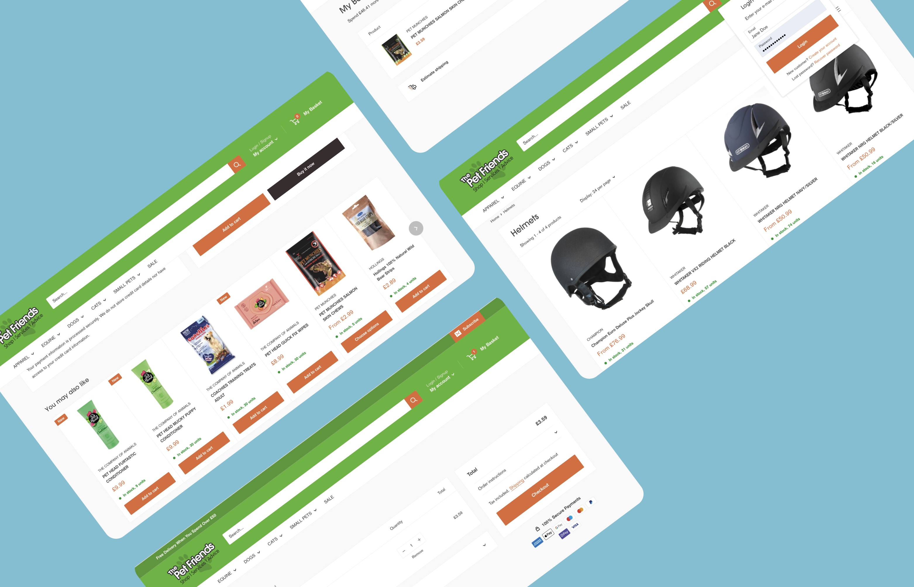
High Fidelity Wireframes
After discovering some of the key issues with item space on the menu, I went back to the sketching process to explore different solutions. Once this was resolved and improvements were made I proceeded to create high fidelity wireframes of the website.
Due to budget and time restraints I concentrated on creating pages that would be used in multiple instances that would be populated with different items such as the home page, product pages and search results.
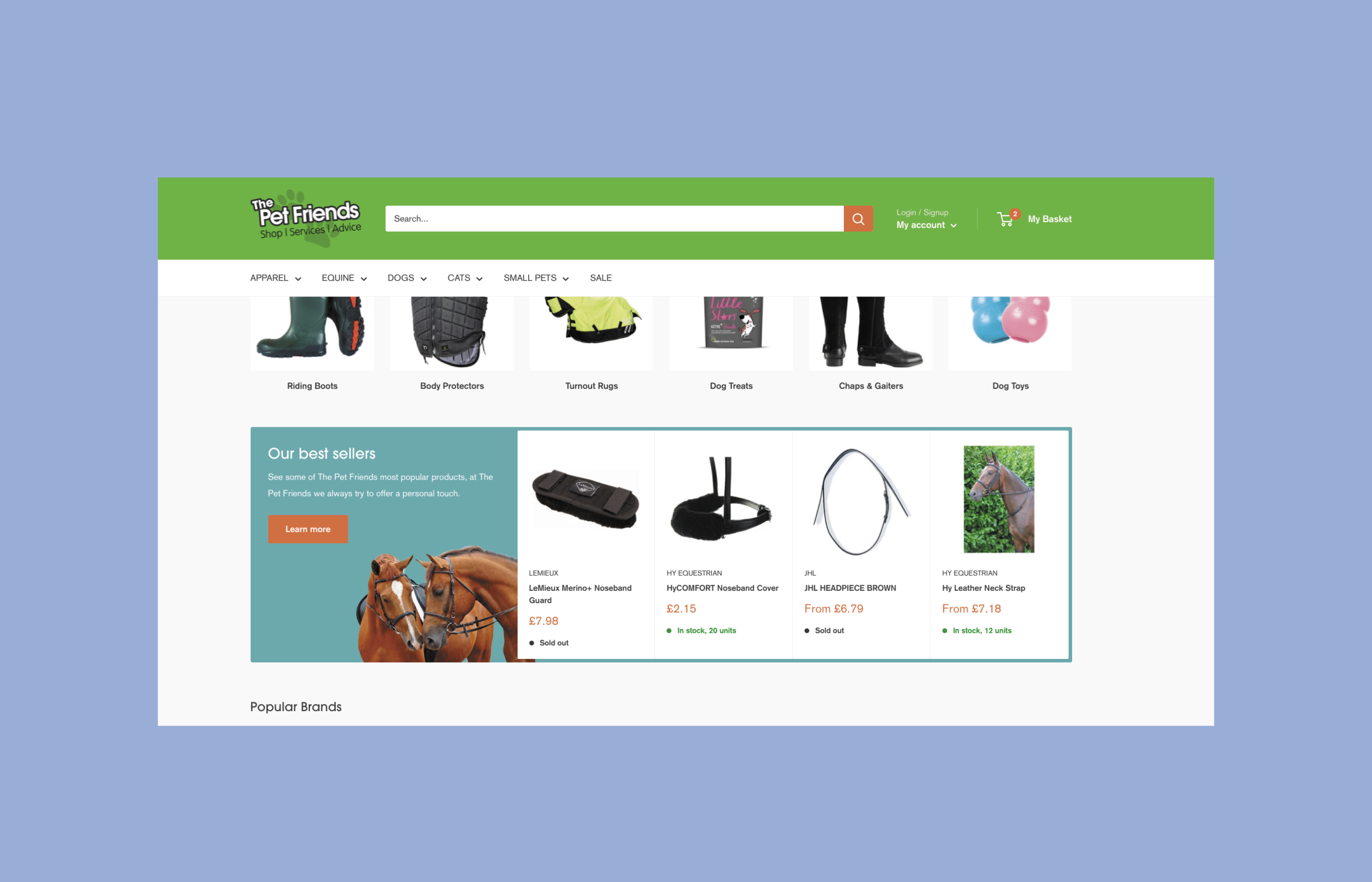

Completed Project
I completed the website within both budget and timeframe, although this was not always certain. Due to the size of the product range on the previous website, I had to appropriately map out all 8000 products so they seamlessly uploaded onto the new website. If this was done incorrectly some products could potentially lose meta data, which in return would affect search and filtering abilities on the website.
It was clear from the initial build of the website that it offered the better user interface that was requested at the started of the project, with both the search bar and product cards significantly improved.

Retrospective
Due to time and budget constraints, there was not much opportunity to engage with consumers on this project. If I was to undertake this project again this is something I would change if given the opportunity. In addition to this, giving more time and consideration to user testing would have aided my decision making and would have resulted in better initial designs.