Bounce House
Challenge
Bounce House is a brand new bounce park that has evolved from the previous company ‘Spring City’. The company offers a new service utilising indoor bouncy castles. Following the rebrand, Bounce House had moved from providing a children only service to offering adult only nights with a bar on site. They therefore wanted the branding to be available for a wider demographic.
They also wanted a better, more refined online and physical presence. They were not happy with the previous incarnation of their website, email campaigns and site branding as they felt they looked ‘cheap’.

What Did I Do?
Web Design, Branding, Email Design
Insight
My initial opinion on what the design was that it had to opt for a darker theme to ‘Spring City’ due to being a bit more orientated around the adults. If the branding was similar then people might not distinguish the two.
I also conducted some competitor research comparing what other parks and amusement facilities were offering and how their branding and online presence looked in comparison. The companies that were looked at were Inflatanation, Base Jump, Air-Nation and Junk Yard Golf.
- Strong Colour – A strong colour palette was the first thing identified as something that needed to be addressed. This was something that needed to be used throughout the website, emails and ‘Bounce House’ site.
- Focus on Bookings – Looking through different competitors websites and digital platforms, it was clear that these companies always focus on making it easy for their users to book.
- User Friendly Emails – Emails usually focused on single services such as children’s birthday parties or one off events like ‘Nerf Nights’.

Solution
After looking at competitors, I decided to look at different elements that would make the park stand out from the competition. I especially looked at nightclubs or venues that used their sites to drive digital engagement.
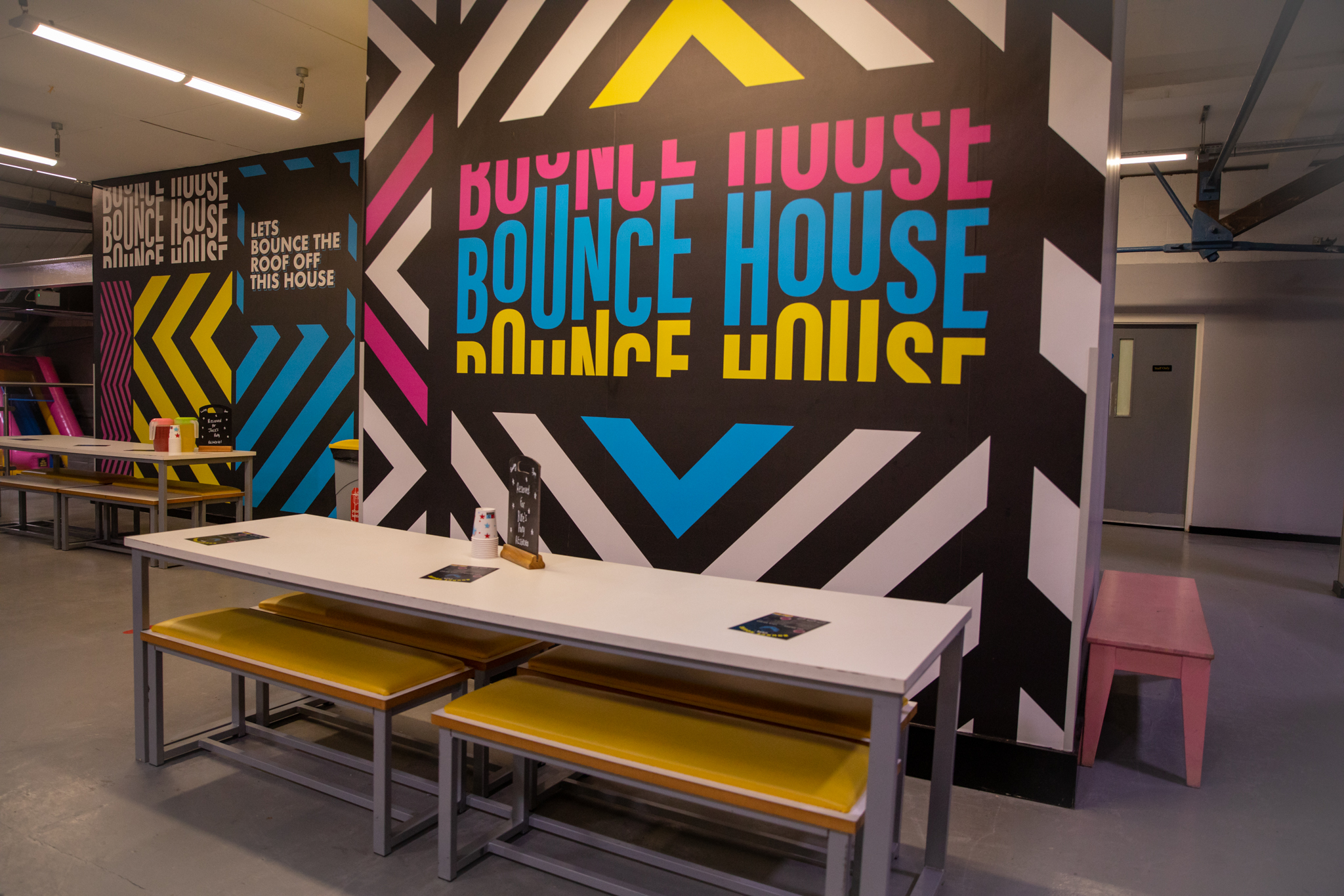
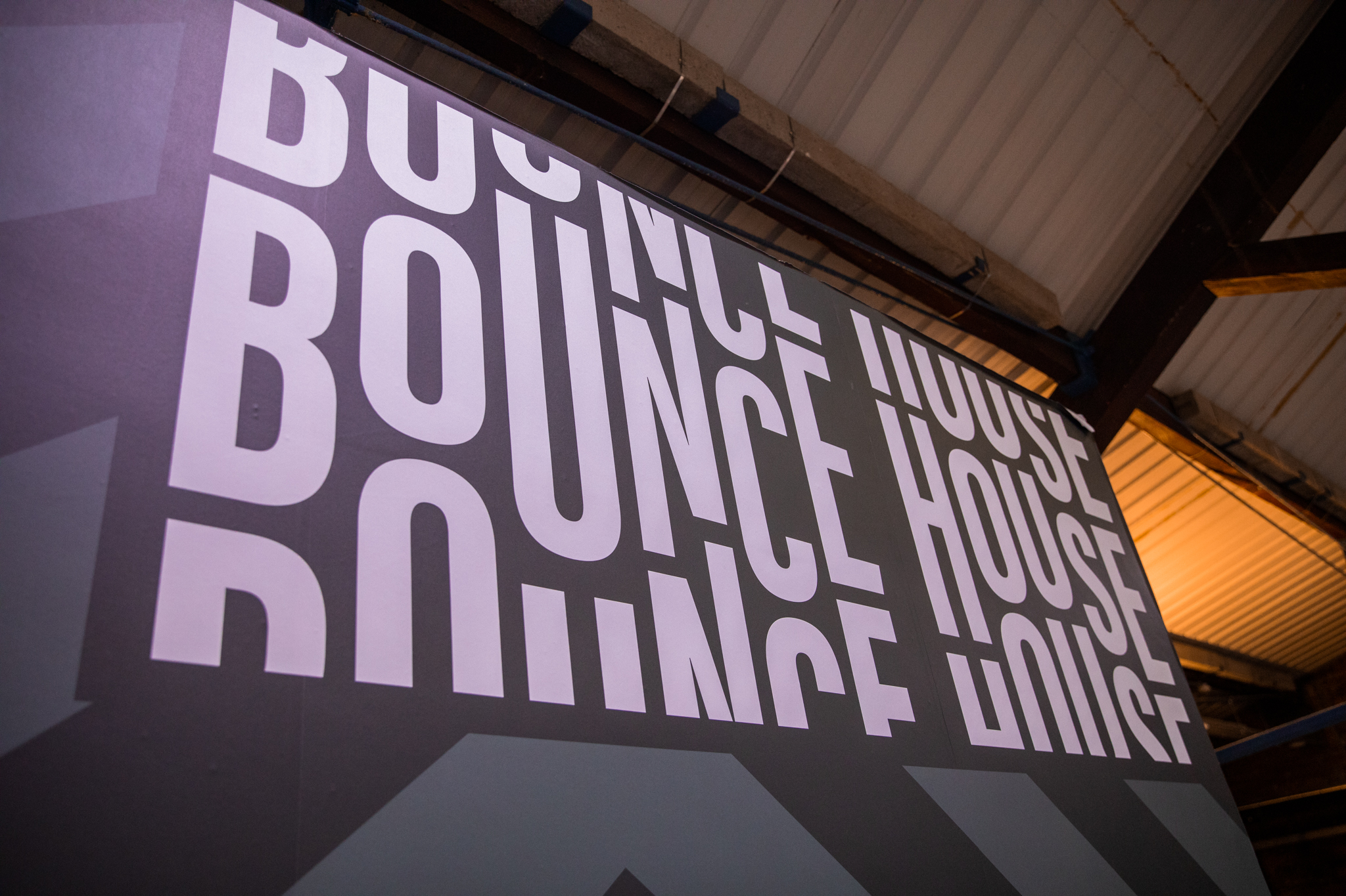
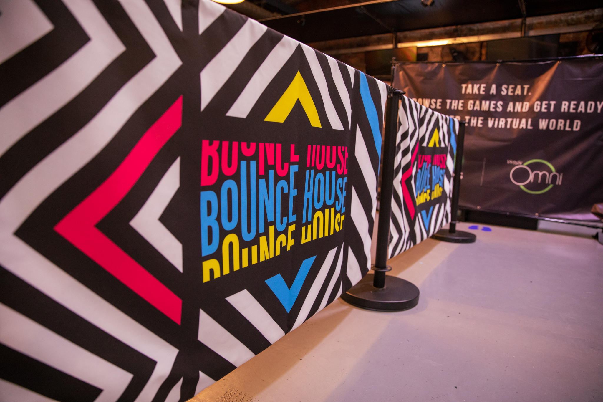
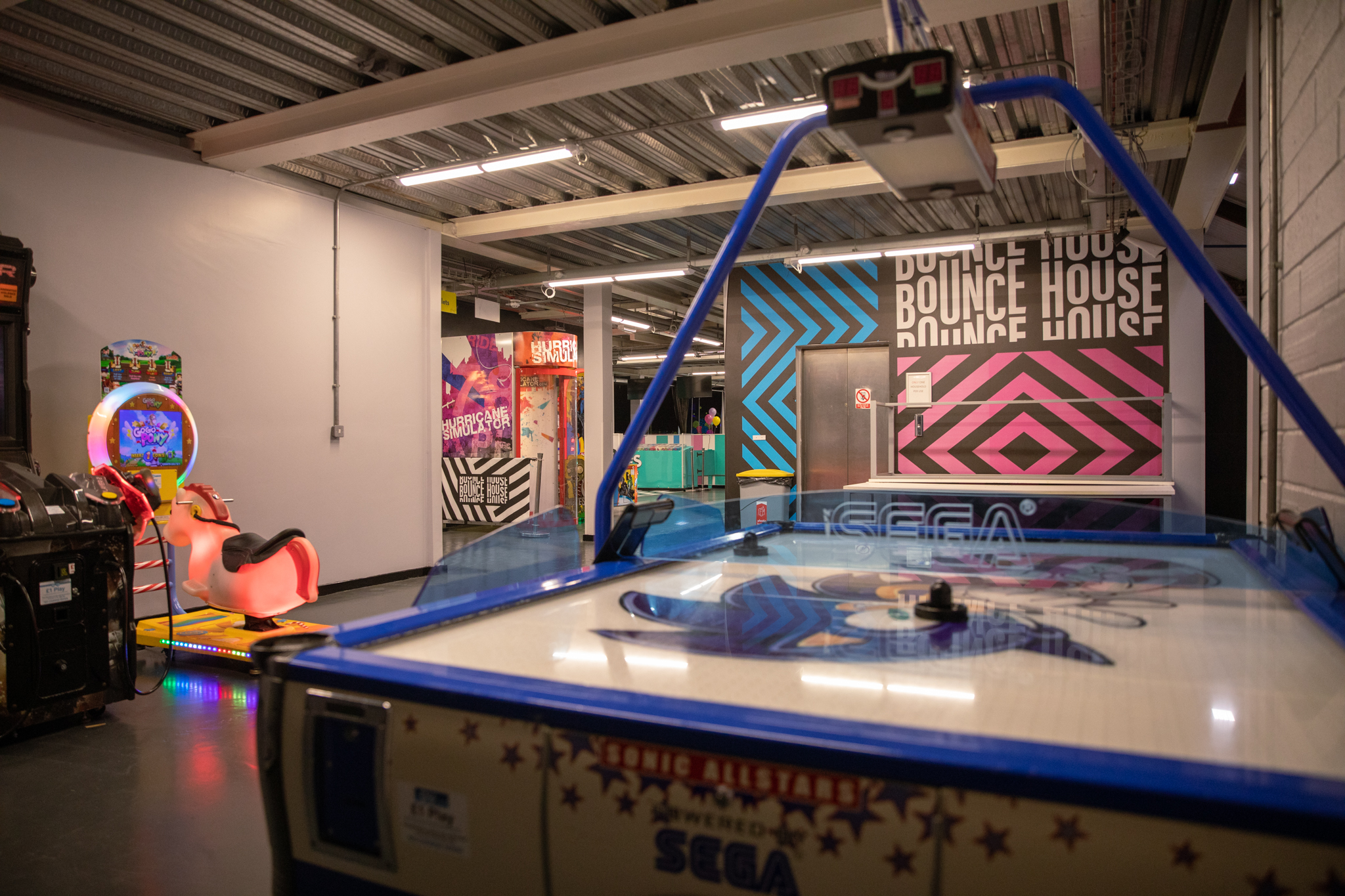
- Branding – After looking through different brands and ideas I presented the idea of creating modern ‘Hacienda’ inspired internals and patterns, particularly chevrons, due to the branding being so recognisable. I also altered the colour palette and fonts to differentiate and modernise the concept.
- Website – I was able to complete some basic wire framing and mock ups for this project and get to work on the website. The aim was to implement the chevrons, colours and utilise strong images throughout the website. Using my research I made the booking option easy by making it stand out on the menu bar.
- Emails – I analysed the current email campaigns that were created by Bounce House and it became clear that there were not enough options for the user to click through to the website or booking, also aesthetically it didn’t look as professional as you would expect.
After acting on this, I then modernised this particular email campaign to use as a template for all the other services that Bounce House has to offer.

Retrospective
Overall this project went really well, the client and customers enjoyed the new park and Bounce House felt the idea and concept behind it made their brand look strong and stand out from competitors in the area.
If I had more time on this project and a larger budget I would have liked to experiment more with the website to make it look even more unique. Due to this being a new venue, items such as content and images came to me later which meant that I was having to repurpose work I had already done.